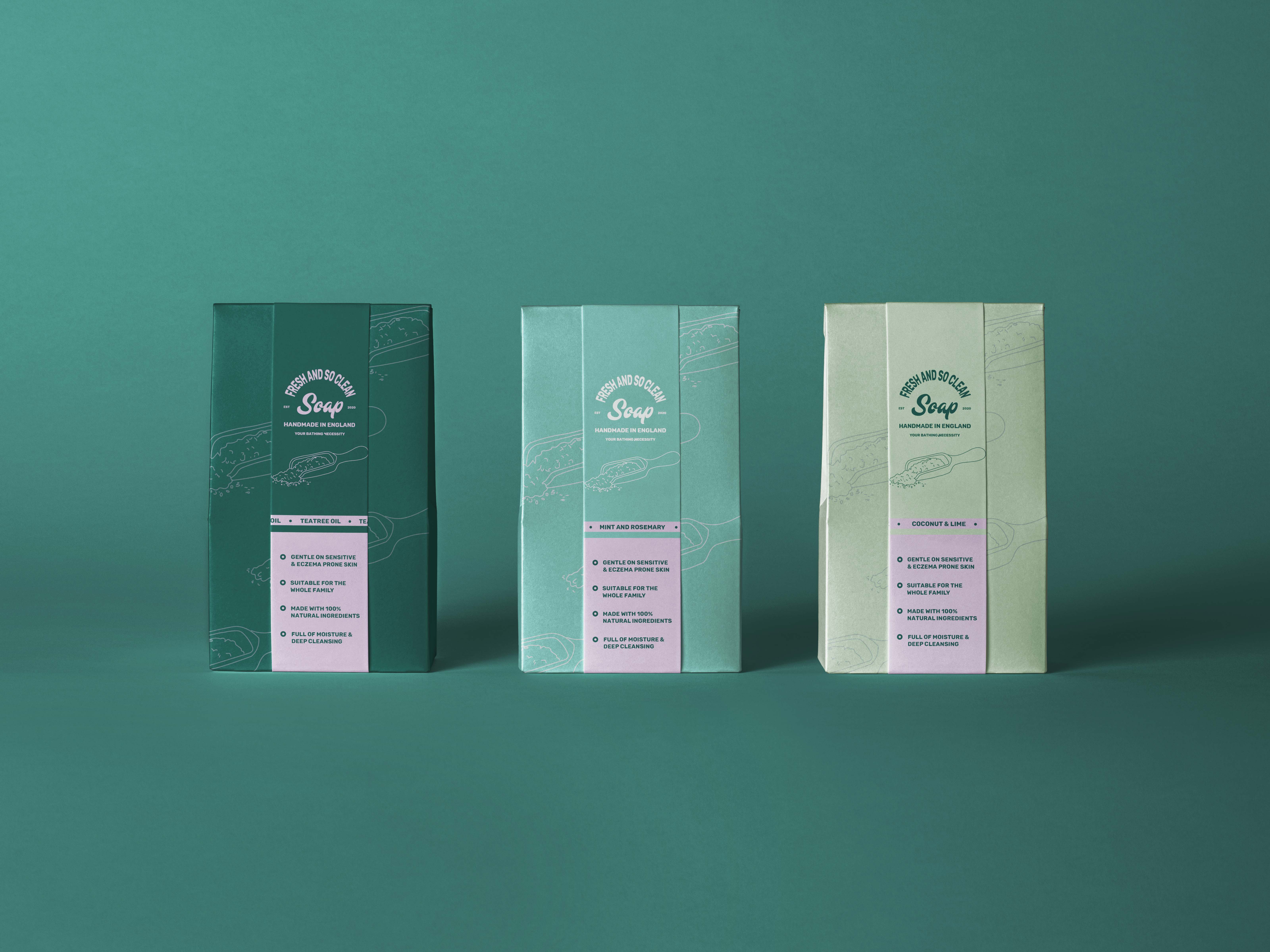
Soap
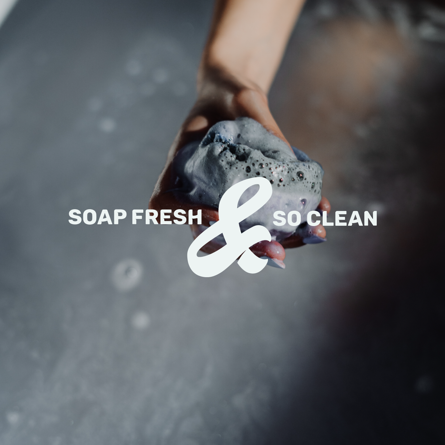
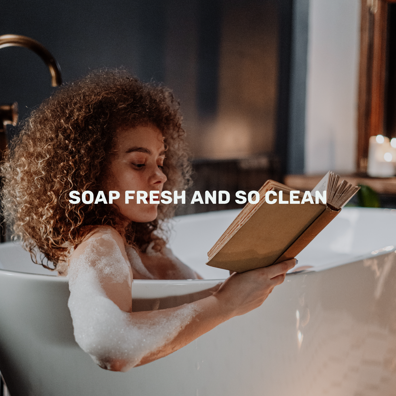
Soap's brand grew out of real family recipes, and it needed an identity that felt just as personal. The brief was to take a 1950s vintage look and bring it into the present, nostalgic and handmade, but with a genuine commitment to sustainability running through every part of it. It couldn't feel mass-produced or generic. It had to feel like Cornwall, like a family kitchen, like something made with care.
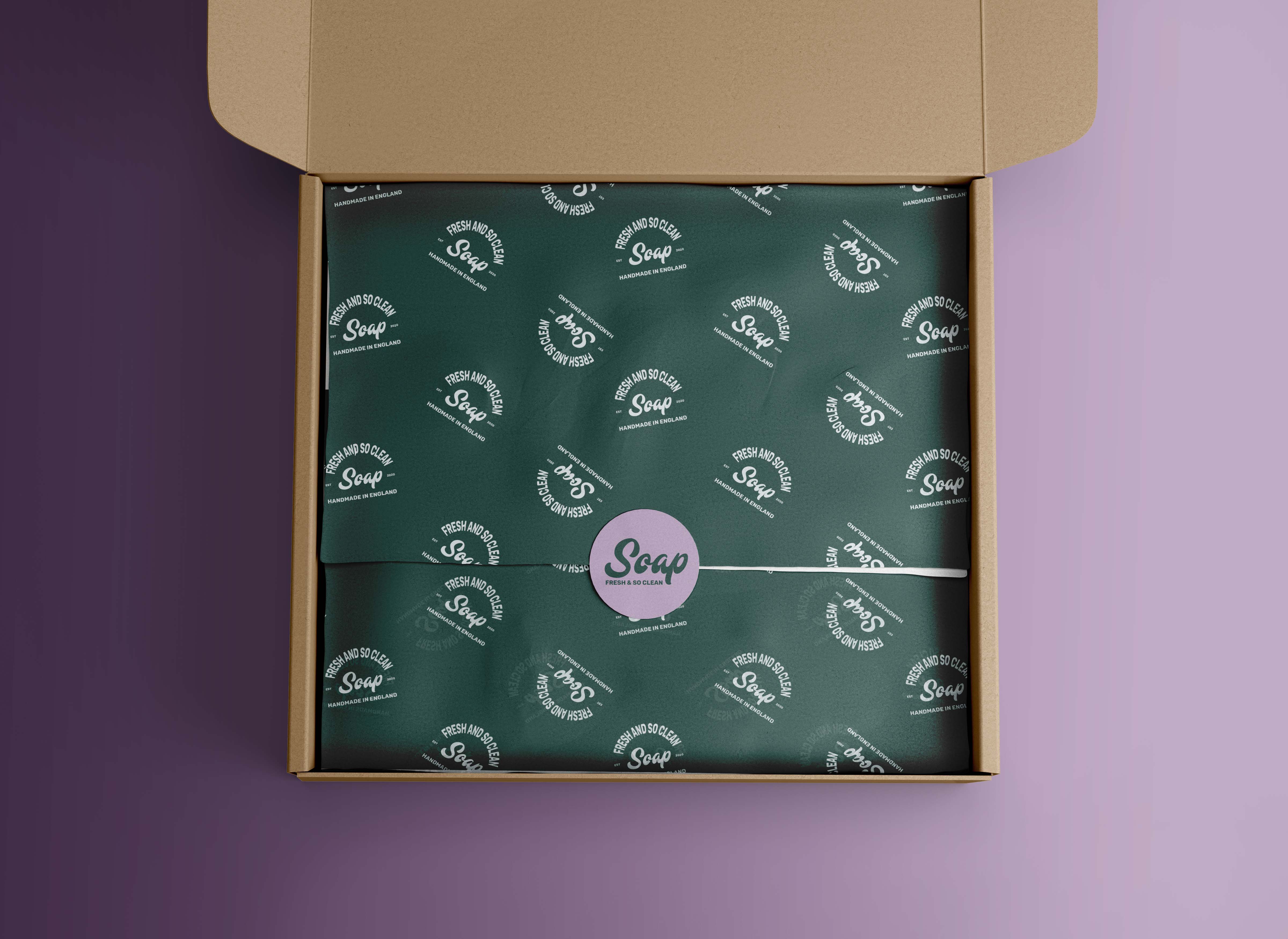
Soap's story wasn't manufactured, the recipes were real, and so was the commitment to sustainable ingredients. That meant the identity needed to earn its nostalgia rather than borrow it, grounding everything in the brand's actual heritage and artisanal roots rather than a generic idea of "vintage."
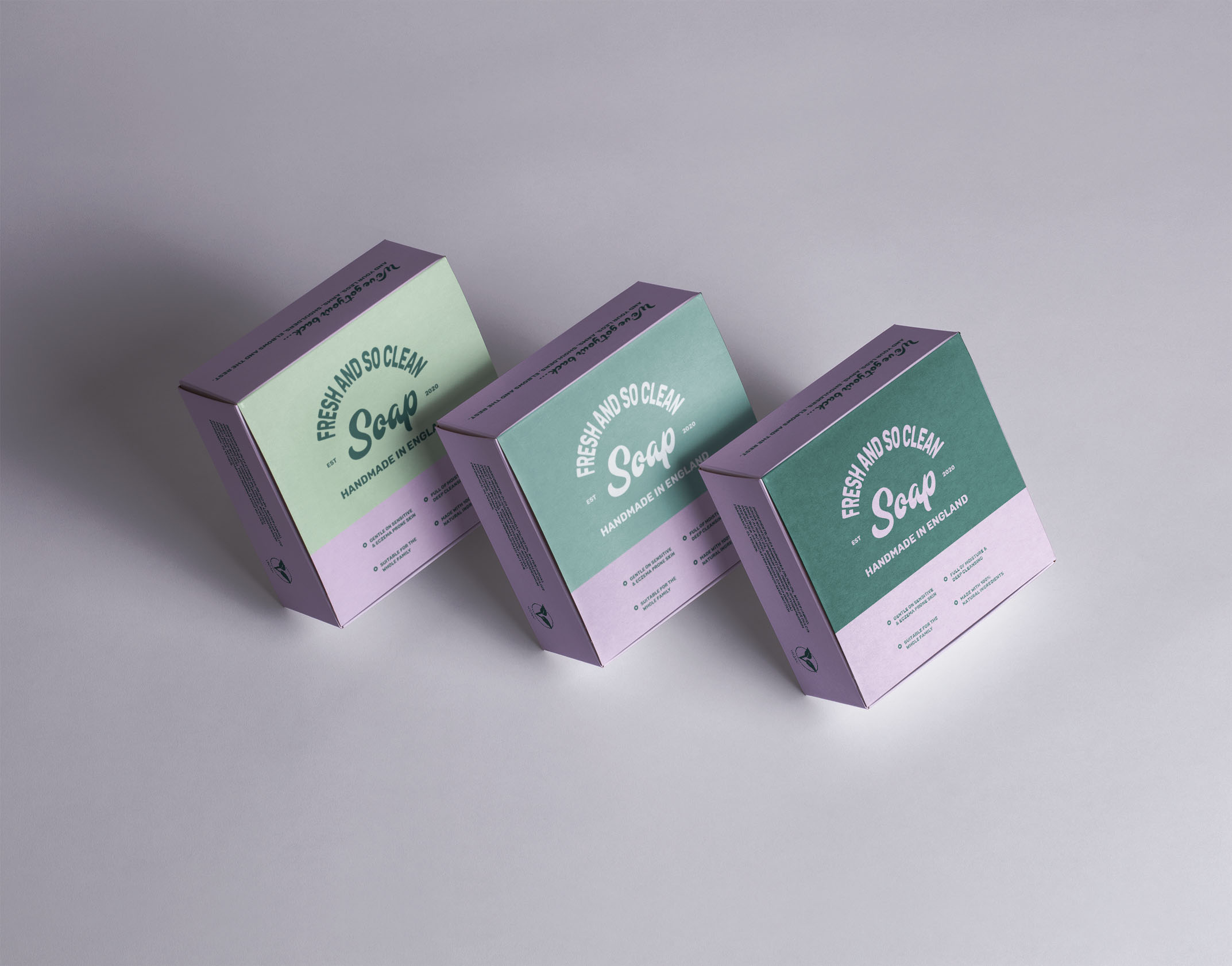
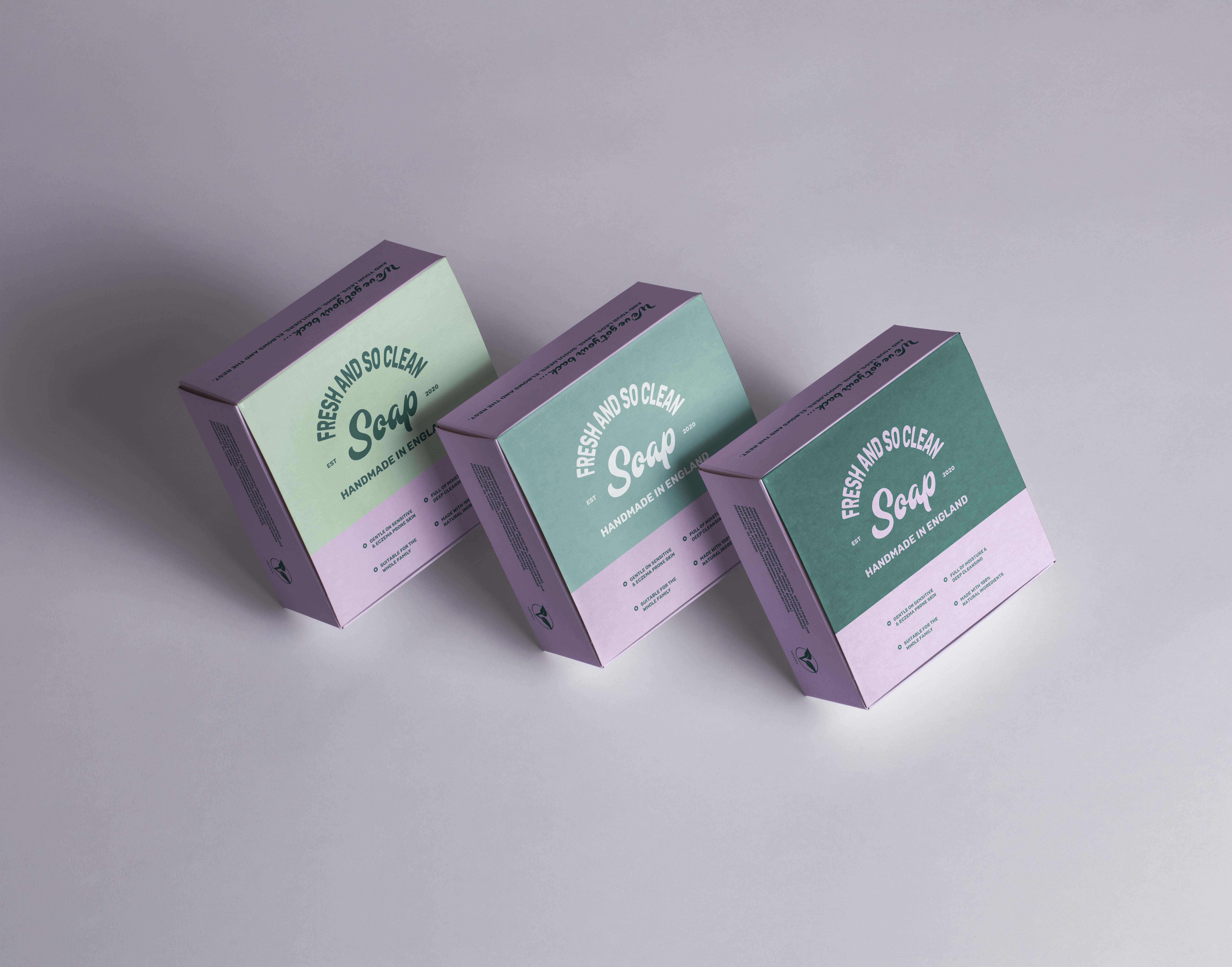
That understanding shaped a vibrant, sustainable colour palette paired with bespoke illustrative accents that lean into the natural, handmade quality of the product. The 50s-inspired styling gives it warmth and familiarity, while the illustration work keeps it feeling distinct rather than dated.
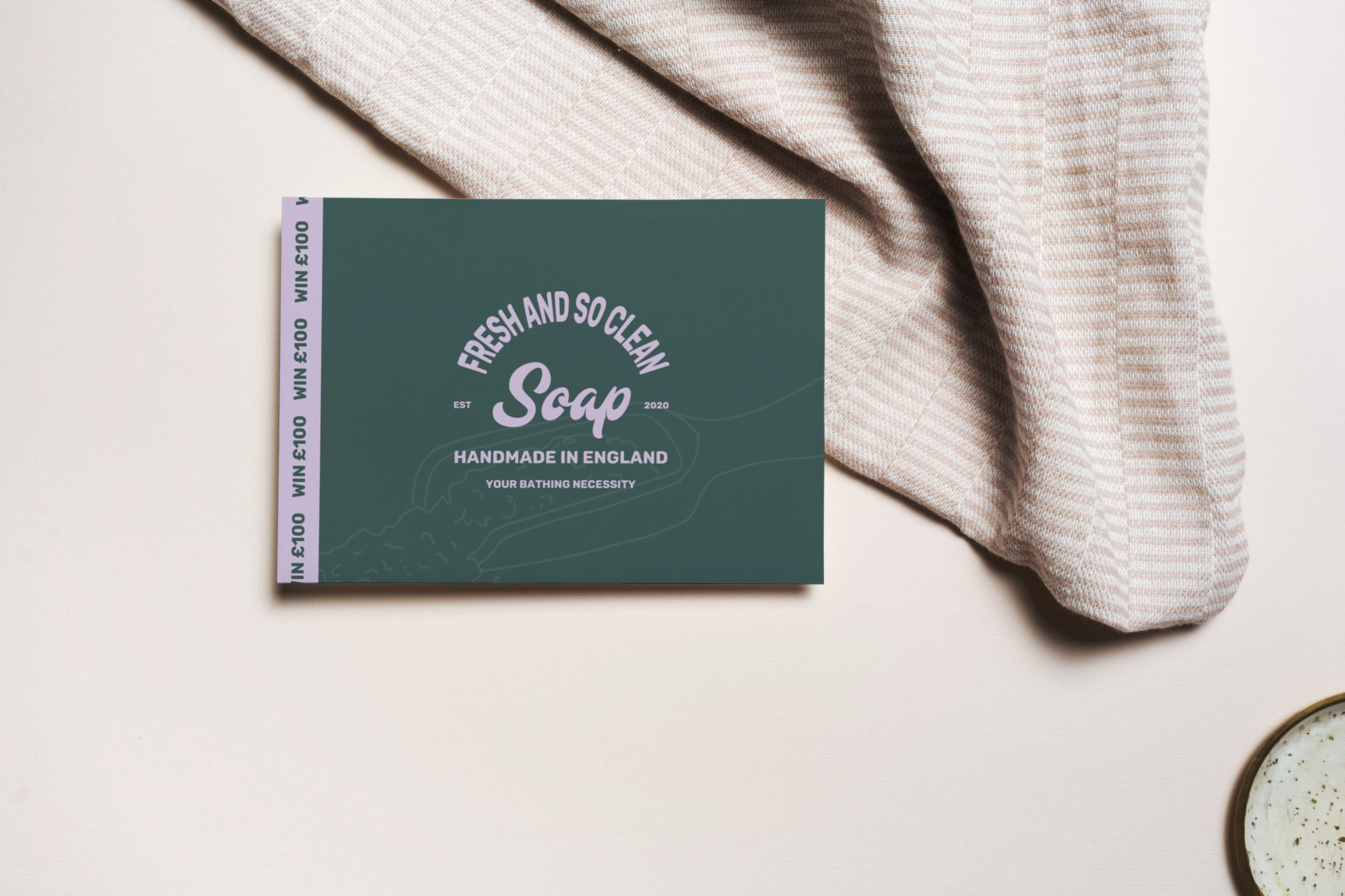
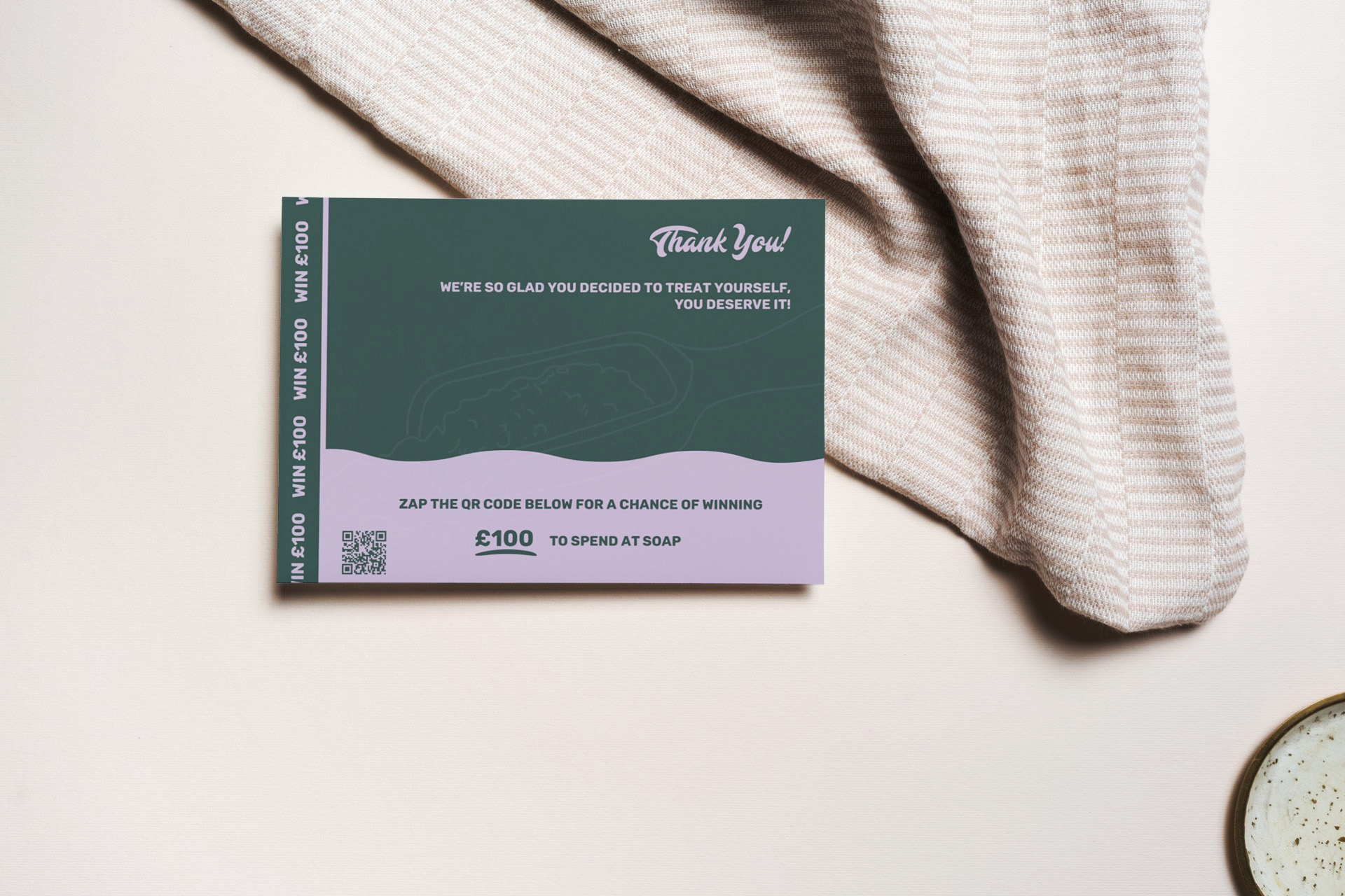
From there, the identity rolled out across every touchpoint, recycled packaging, business stationery, print and digital assets, so it feels consistent wherever people encounter it, without ever feeling corporate.