.png)
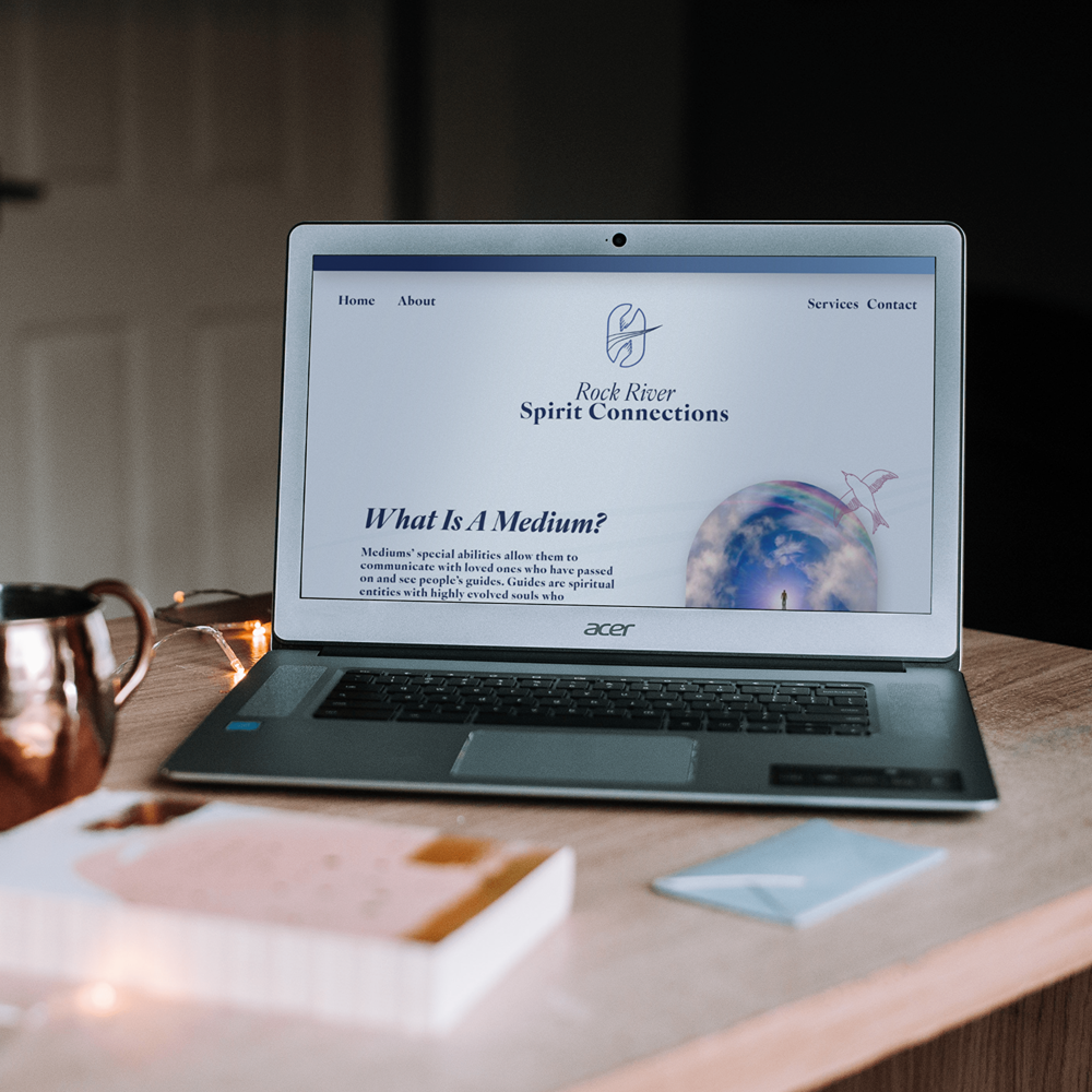
Rock River Spirit Connections
.png)
The practice needed to move away from supernatural clichés toward a visual identity that felt inherently Divine, refined, and grounded. The challenge was bridging the gap between technical mediumship and a warm, accessible spiritual presence, without the visual identity tipping into new-age cliché or losing credibility with a sophisticated clientele.

Kim's training was rooted in serious, professional discipline, not the supernatural clichés people often associate with mediumship. The visual identity needed to read as grounded and credible first, spiritual second, so it could appeal to a sophisticated clientele rather than a new-age aesthetic.
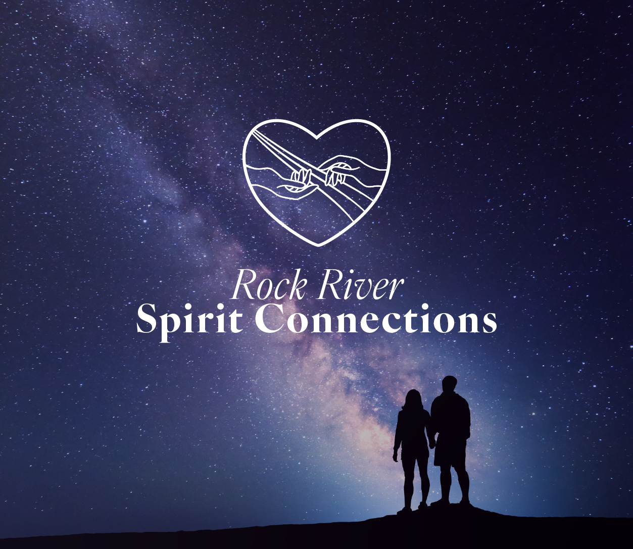
That understanding shaped a stripped-back, "Divine" aesthetic, translating Kim's professional training into a visual language that honours the bridge between inward reflection and outward presence, without leaning on mysticism-heavy tropes.
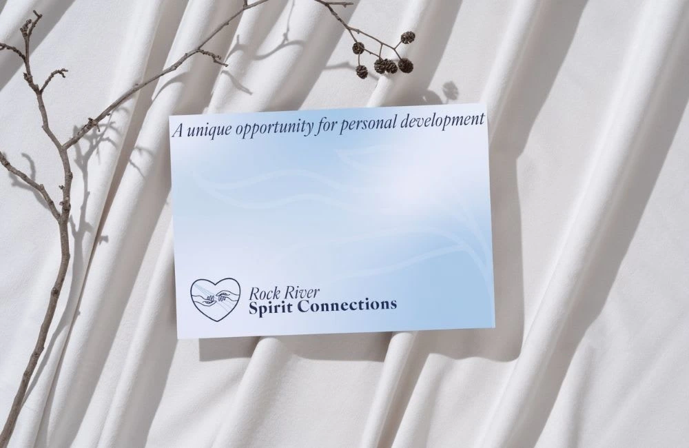
From there, I oversaw the design of every piece of brand collateral and digital asset, ensuring the refined visual identity resonates with clients seeking both clarity and comfort.

.png)