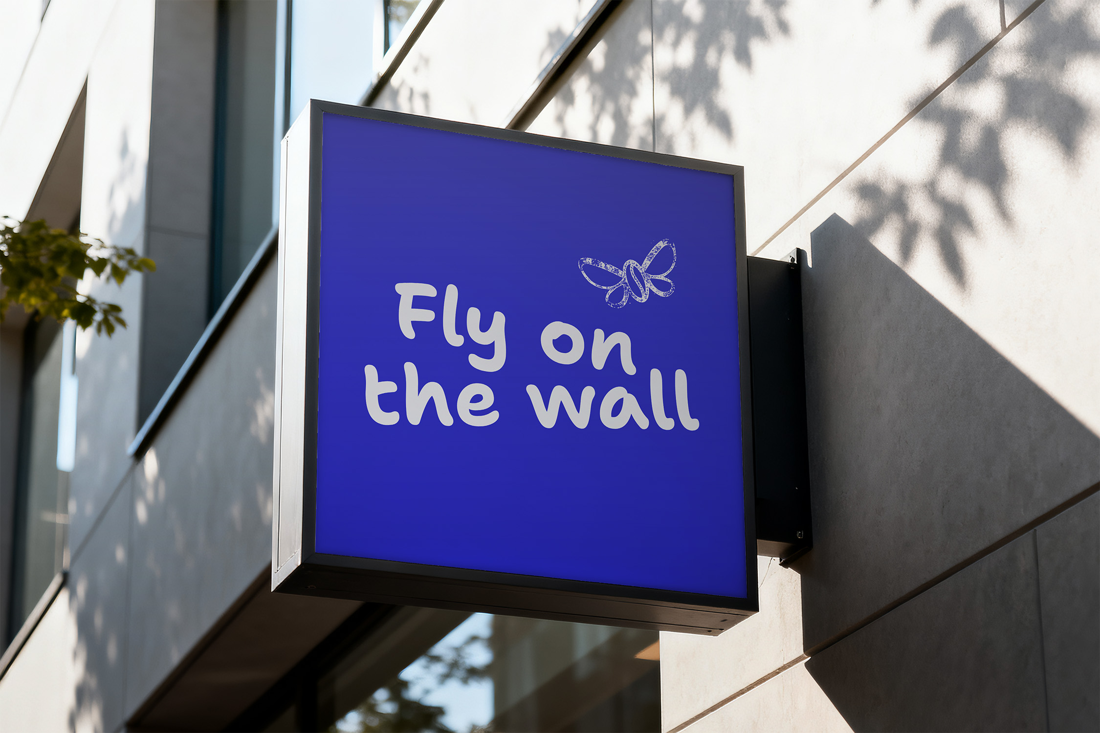
Fly on the Wall

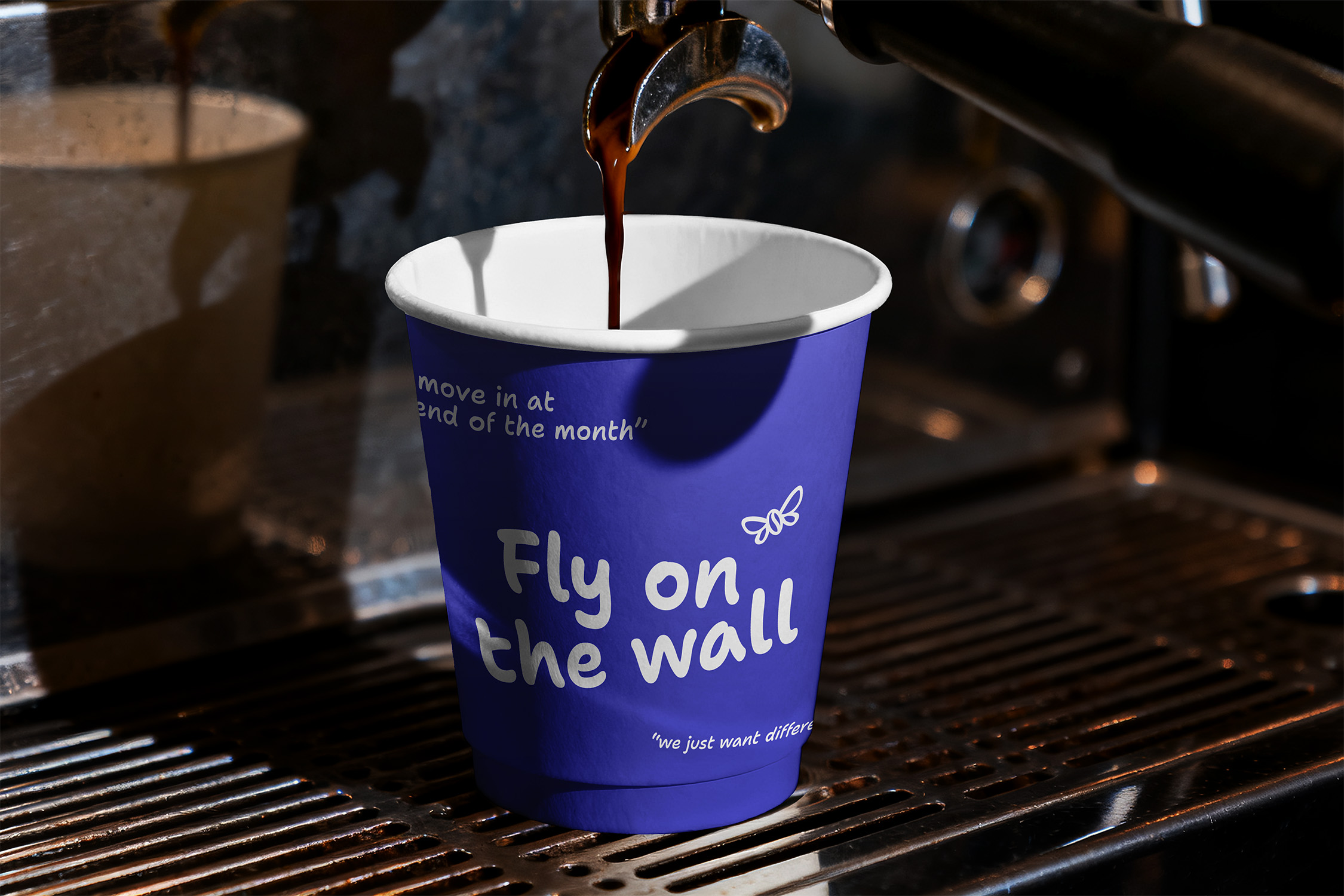
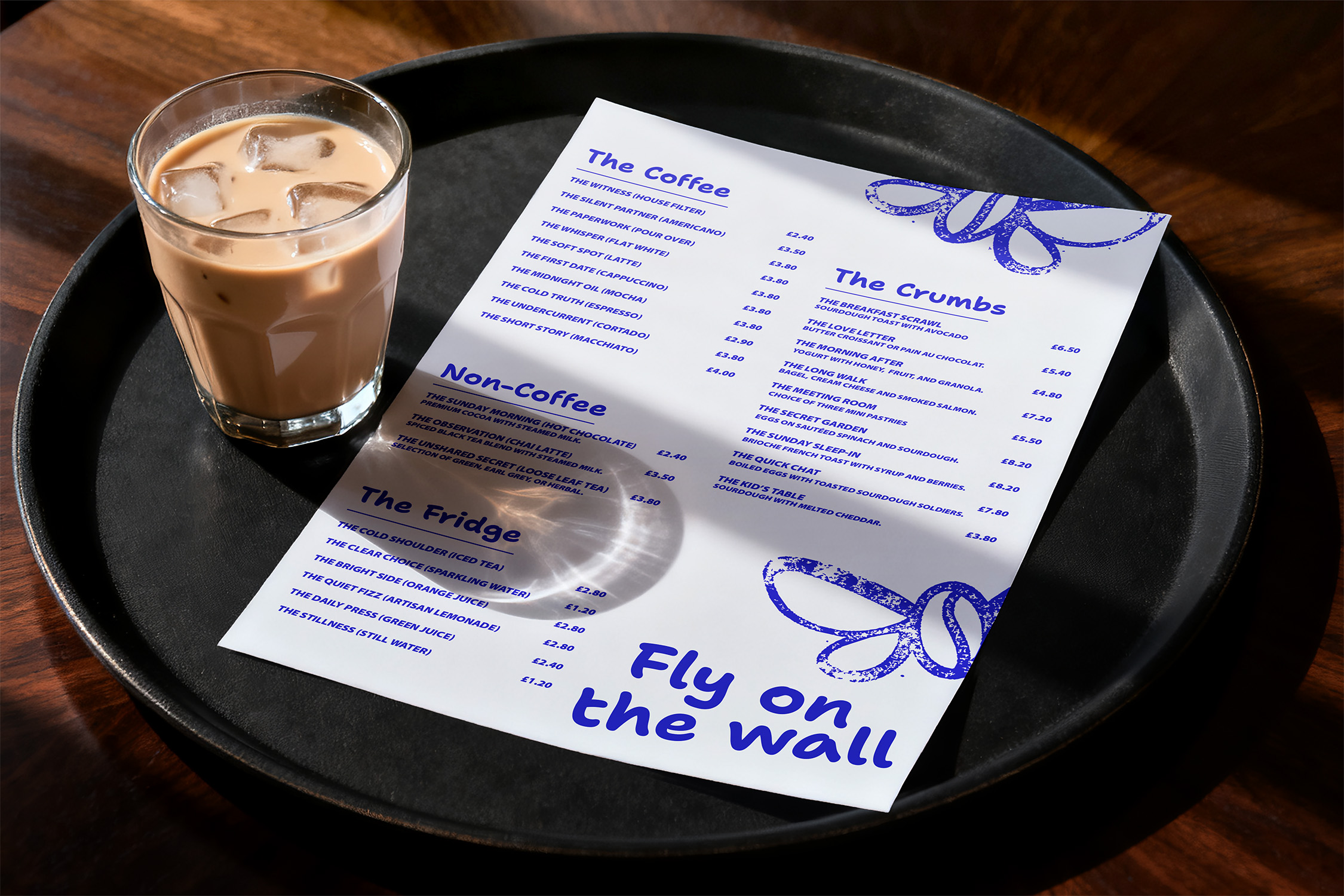
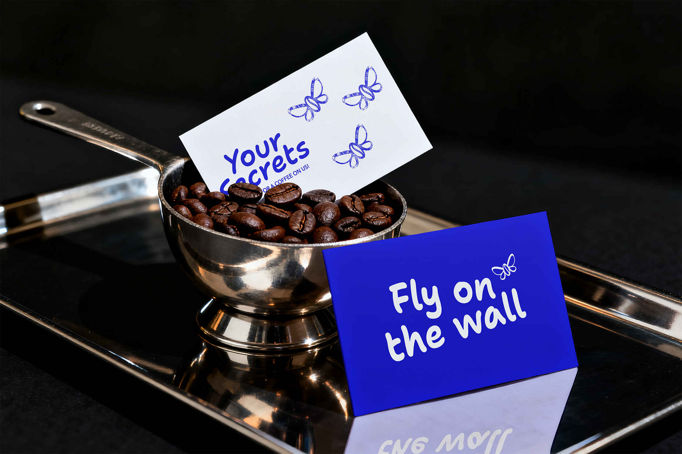
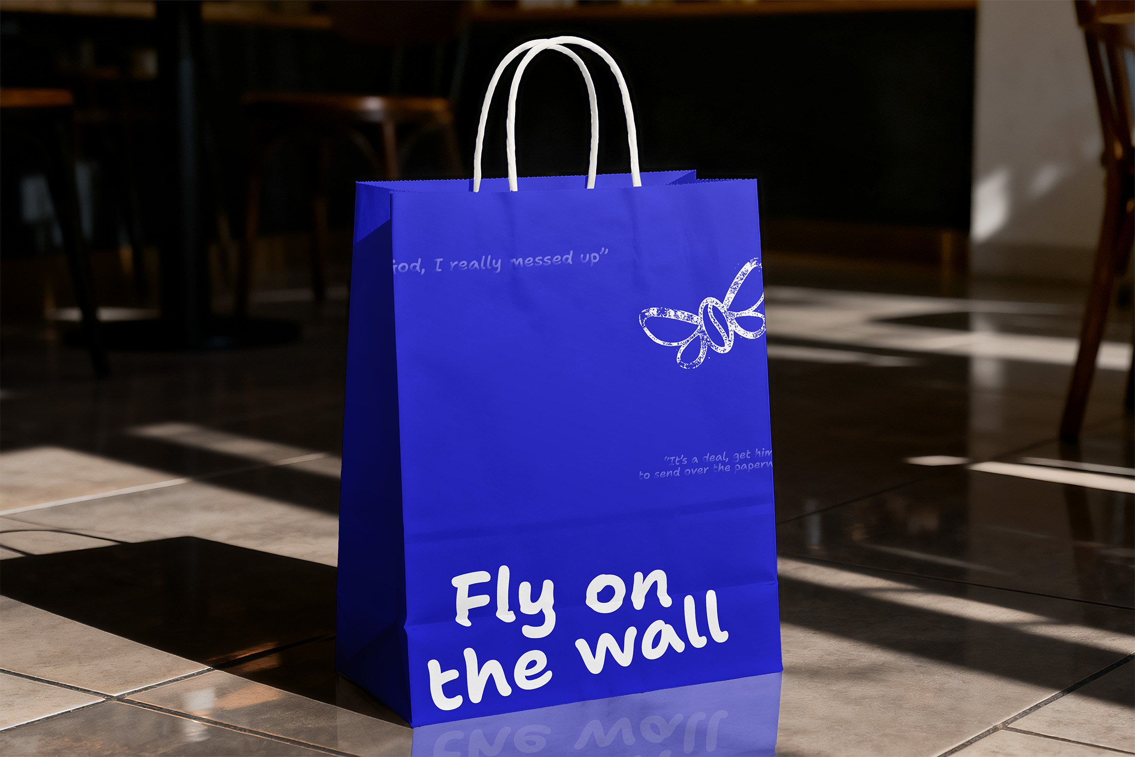
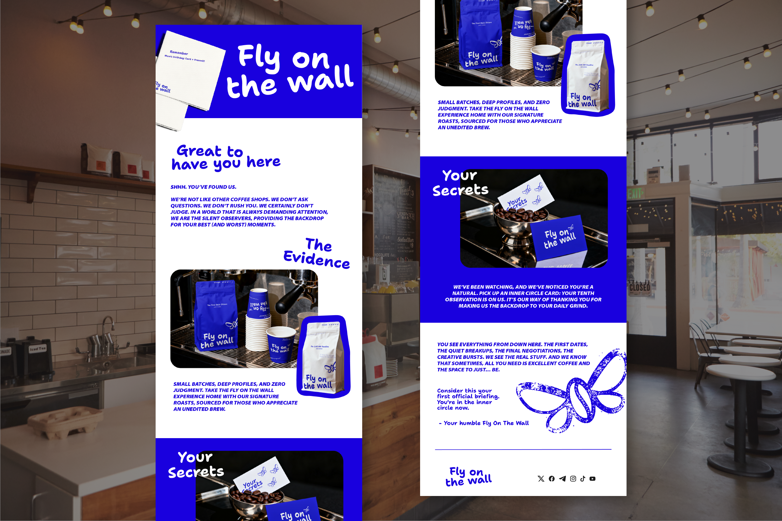
This Dublin coffee brand needed to ditch polished corporate aesthetics for something raw and observational. The challenge was scaling from an intimate flagship to a national presence without losing that "unedited" soul, an identity that feels like it was sketched by someone watching the world from a corner table.
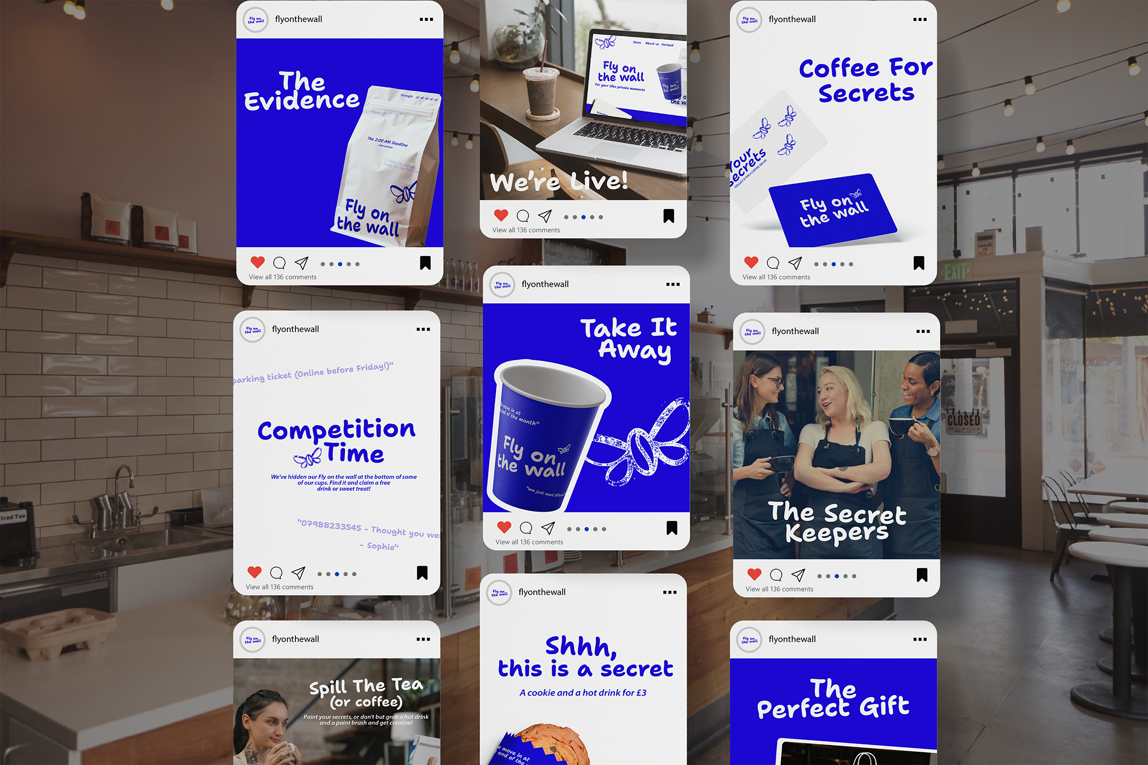
Fly on the Wall's flagship felt like a place you'd actually want to sit, unpolished, observational, real. That corner-table energy was the whole point, and the risk of growing to a national footprint was sanding it down into something generic.
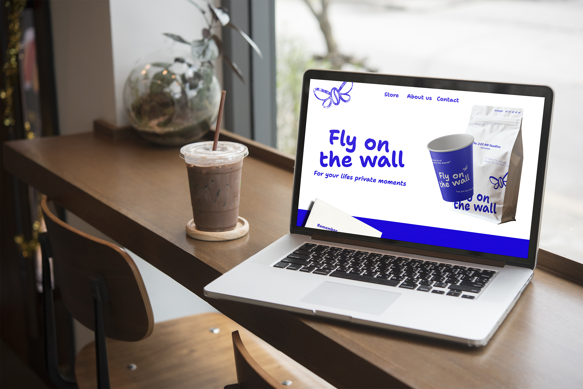
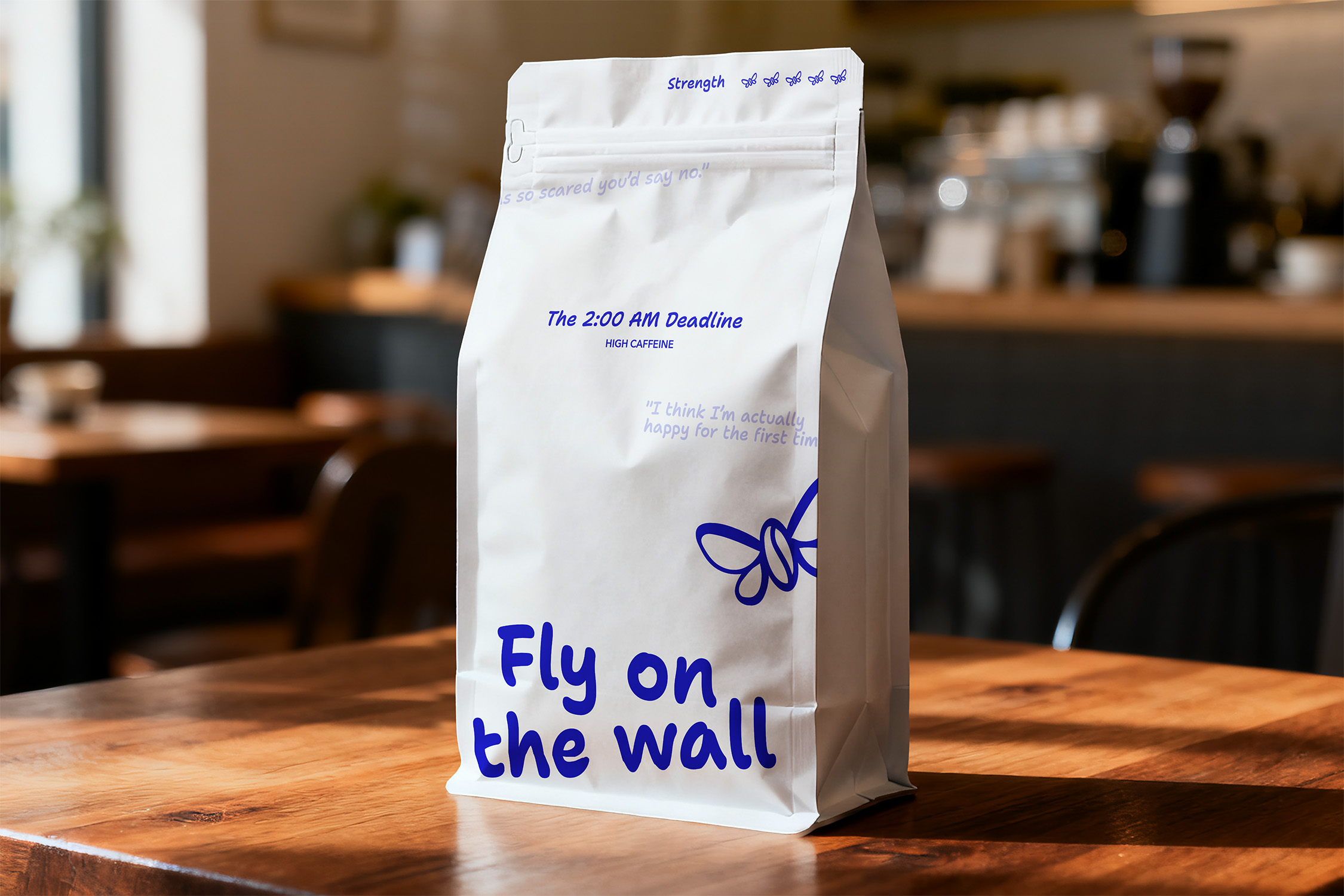
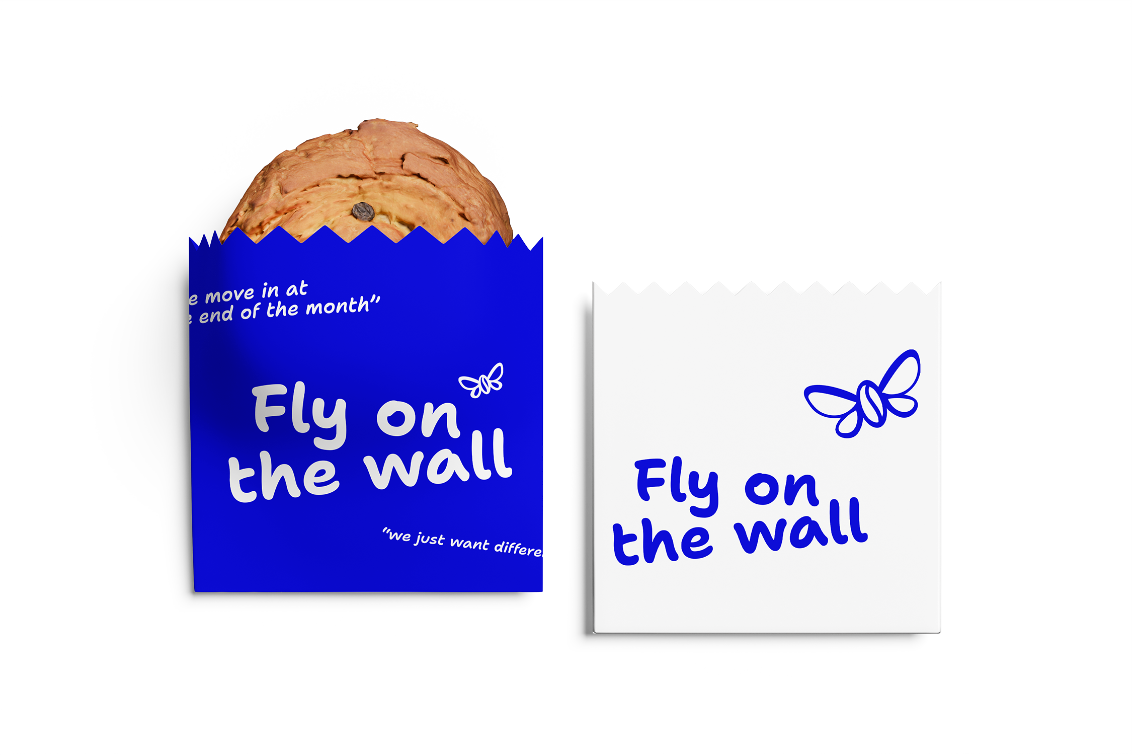
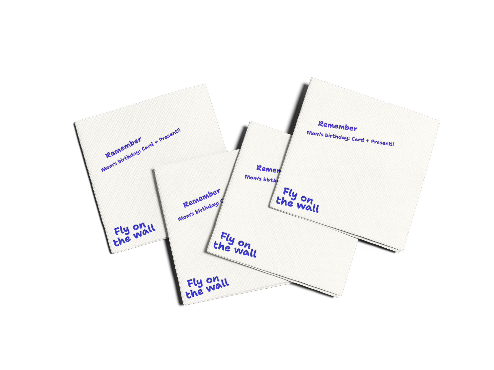
I championed an "unedited" design language, stripping back the corporate polish and building a hand-drawn indigo sketch aesthetic so every asset felt observational and authentic, not manufactured.
I oversaw the end-to-end delivery of a versatile identity system that scales seamlessly from shopfronts to national retail packaging.