CABŌ
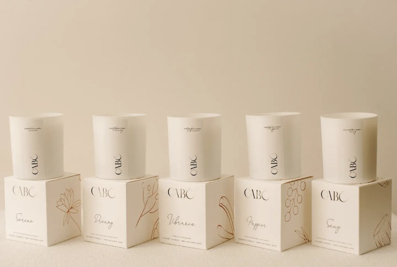
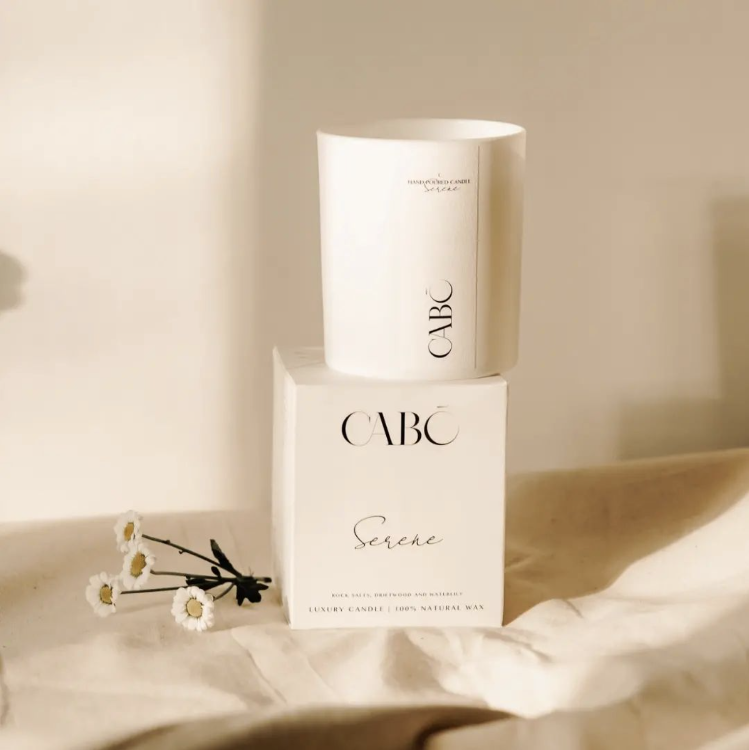
CABŌ sought a unique visual identity to differentiate its hand-poured candles in a crowded UK market. The challenge was pivoting away from mass-market candle aesthetics toward something that felt genuinely sophisticated, a brand people would want to display, not just burn.
.png)
Talking with CABŌ, the story that came through wasn't about candles as products; it was about ritual, about the moment a day quiets down into evening. That was the thread the whole identity needed to hang from.
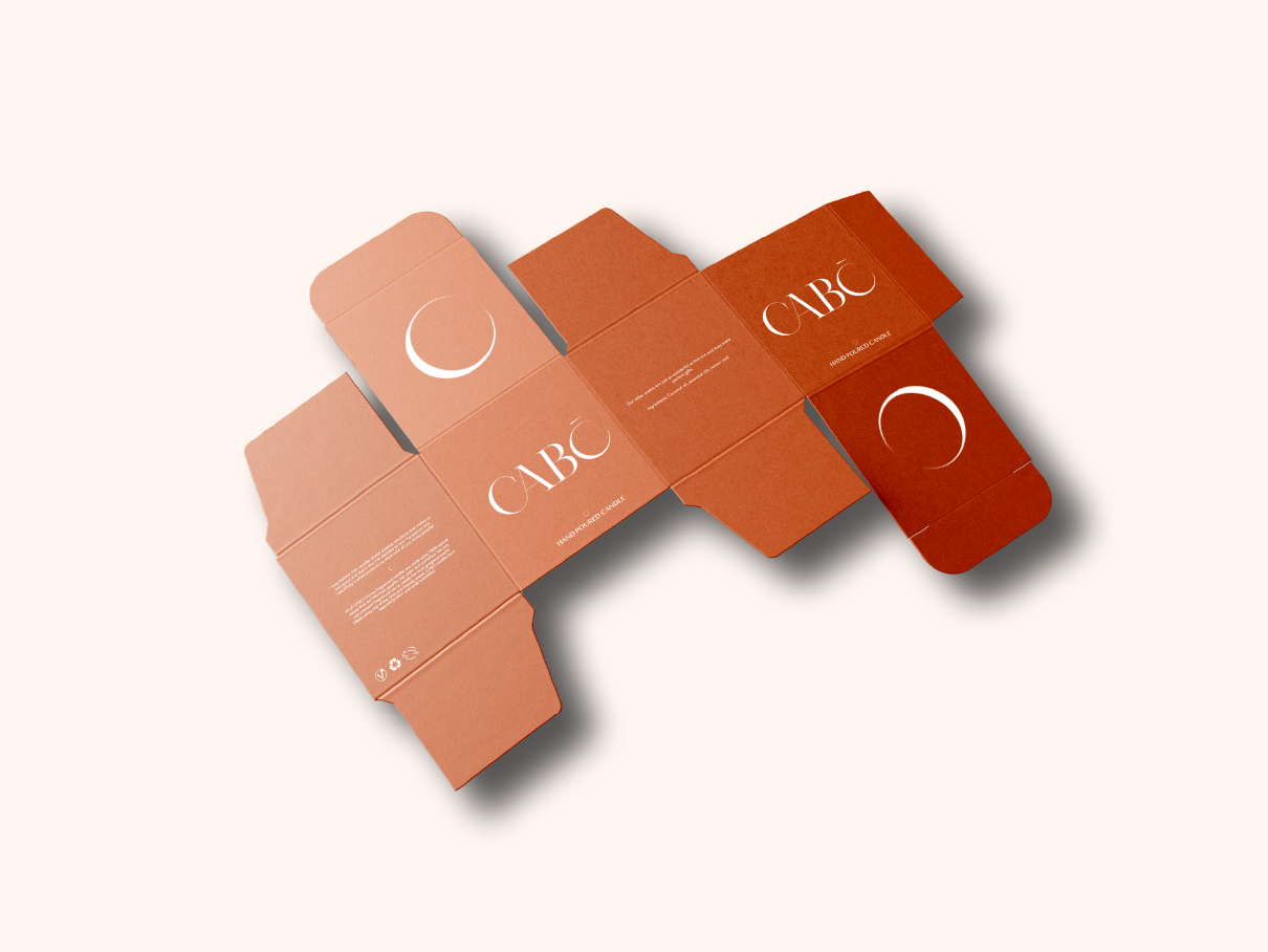
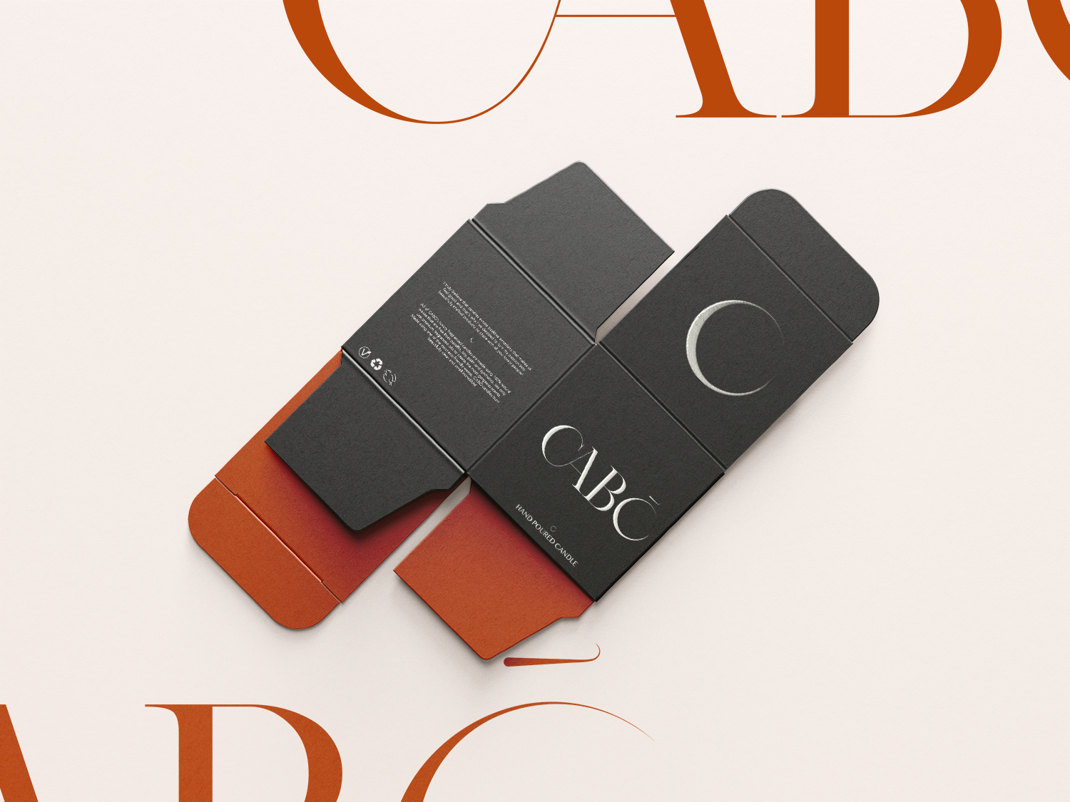
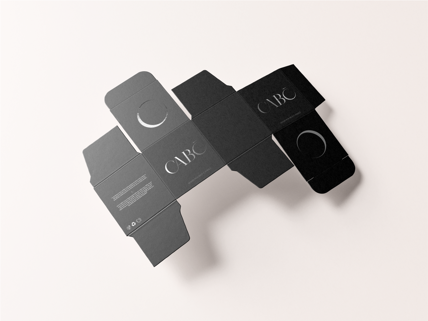
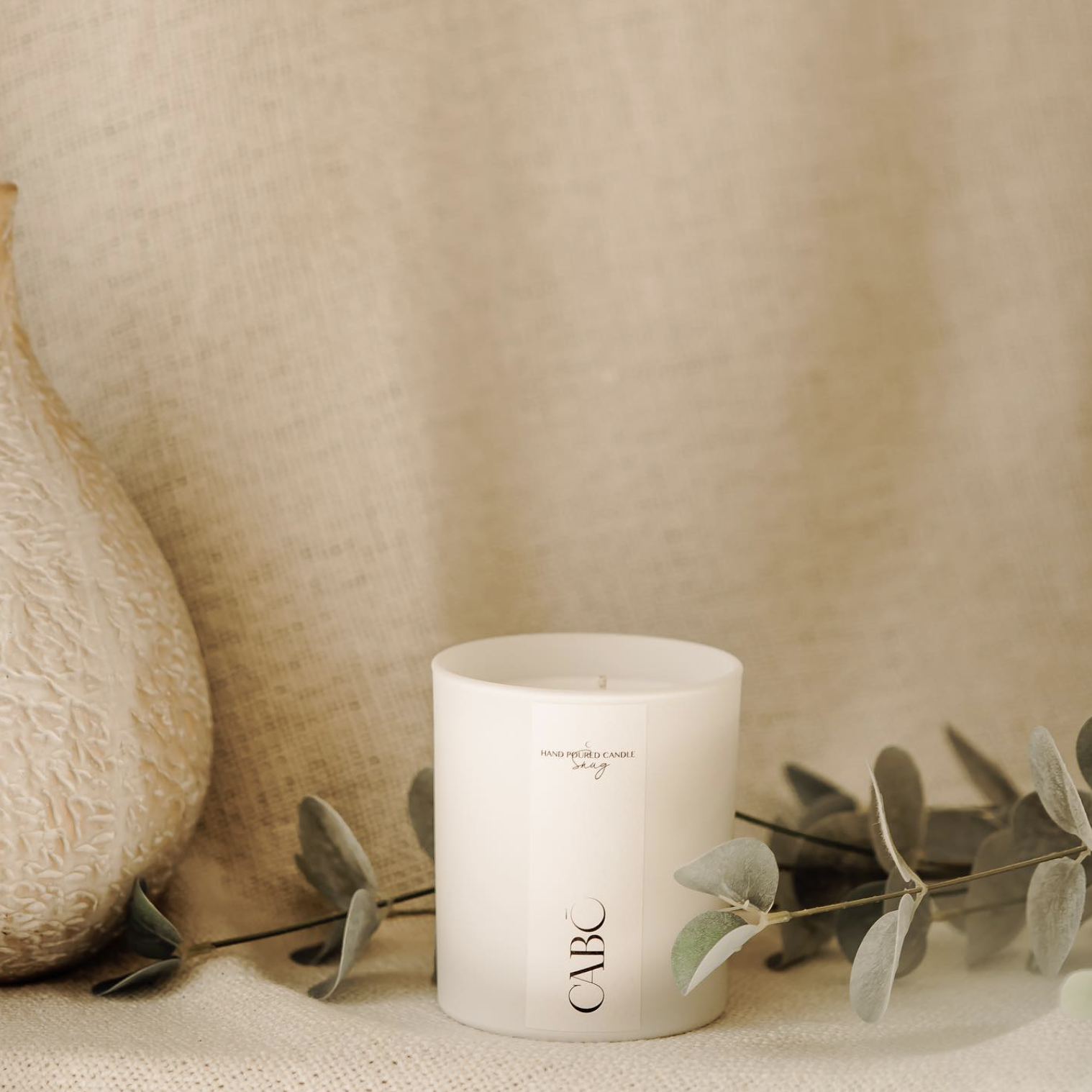
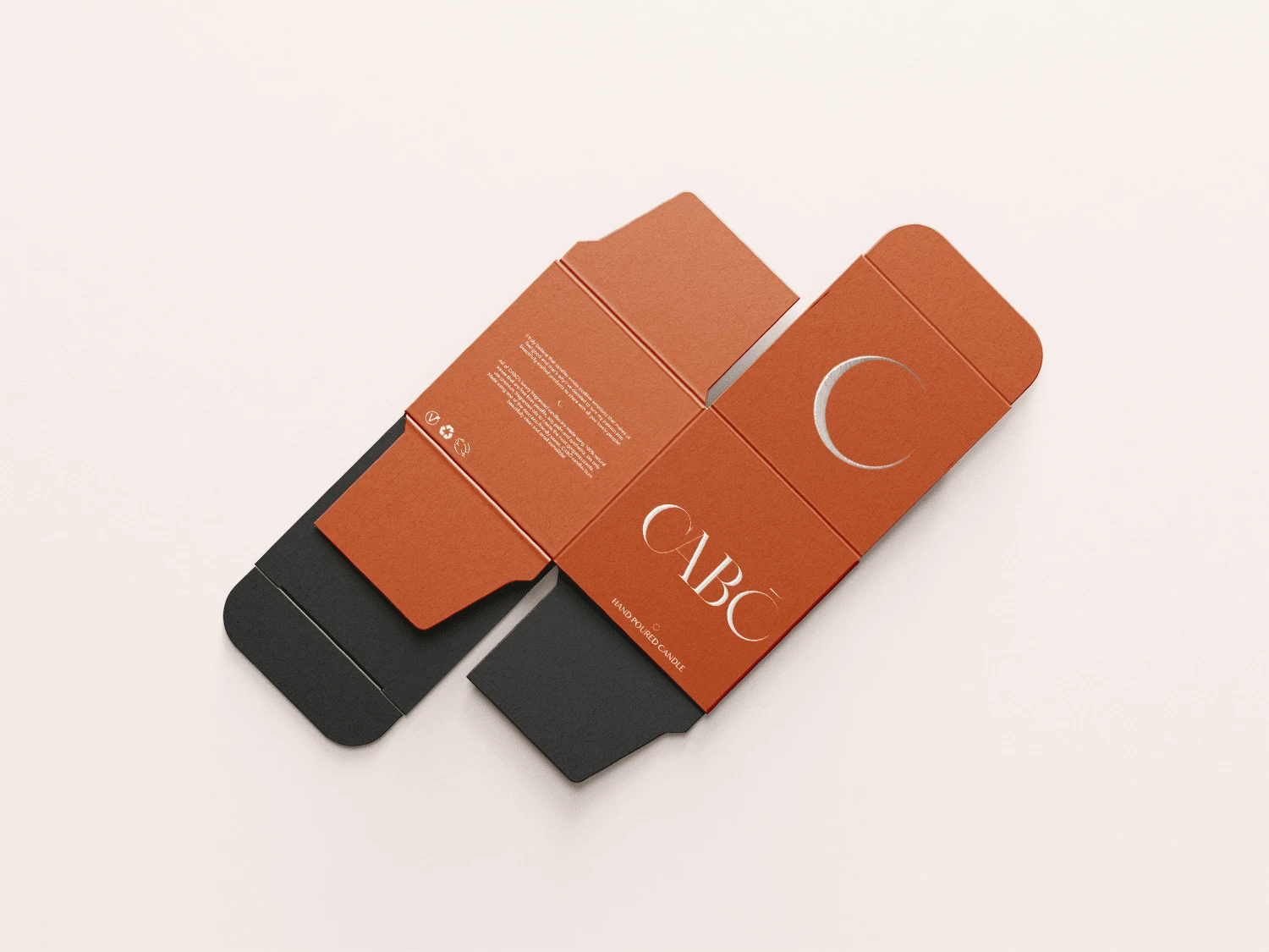
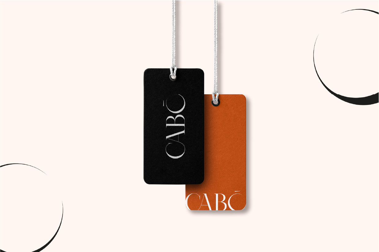
That idea shaped the mark itself: a custom logotype with a lunar-inspired 'O', so the name carries a quiet nod to the moon in the middle of every label. I built the typography and visual language around luxury and tranquility together, aiming for a shelf presence that feels calm rather than shouty.
From there I managed the layout and material specs for the packaging, making sure the tactile experience; the weight of the box, the finish of the label; matched the product inside, and carried that same language out to tags, stationery, and email marketing.